Why 16px Is Not the Same Size in Every Font
Set two fonts to 16px in CSS and you might expect the letters to be exactly the same height. They often are not even close. One typeface may…
Read article
Practical font guides, typography ideas, and thoughtful advice for choosing type.
Set two fonts to 16px in CSS and you might expect the letters to be exactly the same height. They often are not even close. One typeface may…
Read articleImagine two bottles of perfume sitting next to each other. Both contain the same amount of product. Both use similarly shaped bottles. Both have unfamiliar brand names. On…
Read articleLook at the lowercase letter a in your handwriting, then compare it with the same letter in a book. There is a good chance they do not look…
Read articleDownload a font family today and you might find several files inside the folder: They may all appear to contain the same typeface, so why are there four…
Read articleTake the letters H H and place exactly 20 units between them. Now do the same with A V. Mathematically, the spacing is identical. Visually, it probably is…
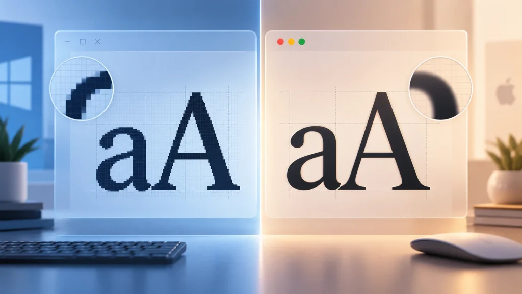
Read articleYou install exactly the same font on two computers. Same font file. Same weight. Same size. Same text. Yet on Windows the letters might look slightly sharper and…
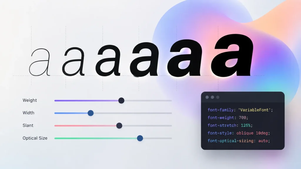
Read articleA traditional font family might arrive as a folder containing Regular, Medium, SemiBold, Bold, Condensed, Italic and perhaps a dozen other files. A variable font can potentially contain…
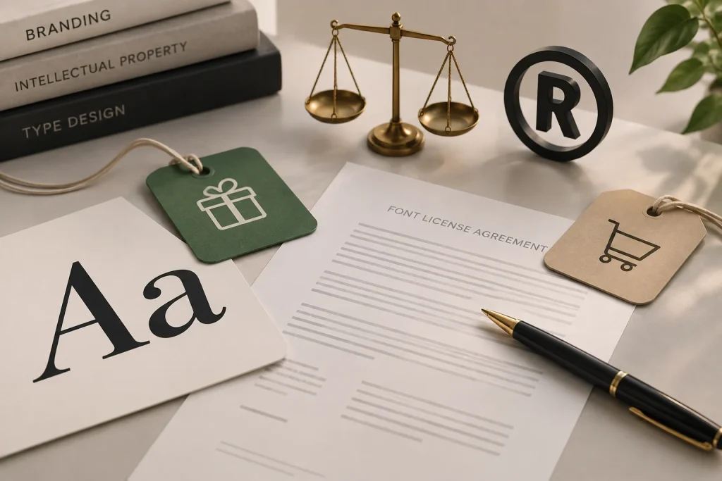
Read articleYou find the perfect font, type out your brand name and the logo looks exactly right. Then comes the less exciting question: are you actually allowed to use…
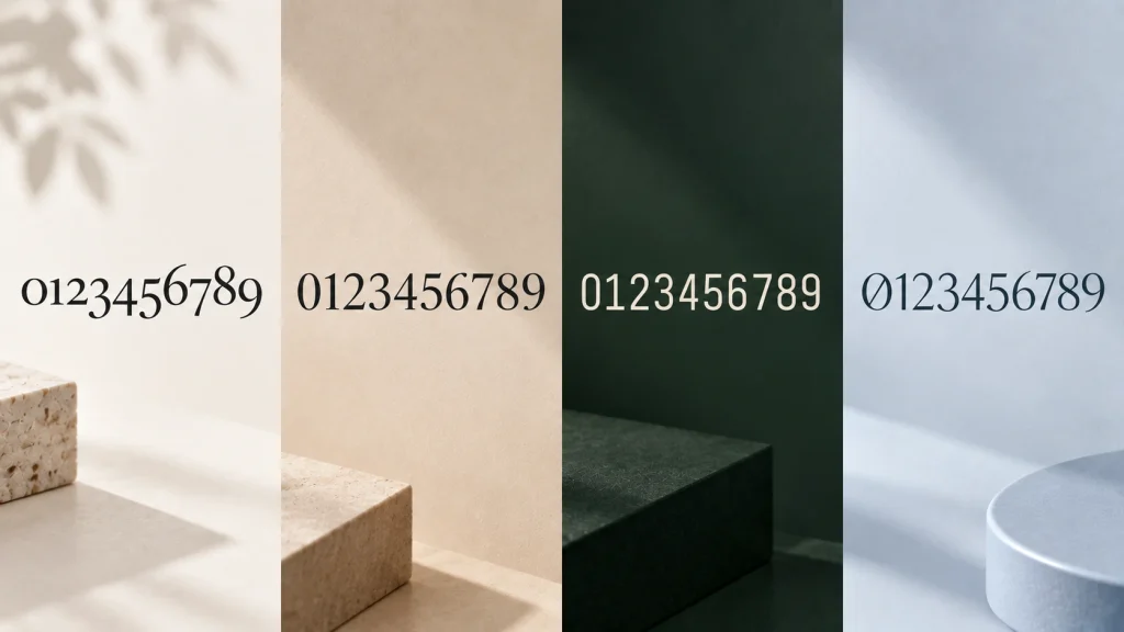
Read articleMost people spend a lot of time looking at the letters in a font and almost no time looking at its numbers. Yet numbers appear everywhere: prices, dates,…
Read articlePerfect typography is starting to look a little too perfect. After years of ultra-clean layouts, geometric sans-serif fonts and carefully polished social graphics, designers in 2026 are increasingly…
Read articleFor years, technology branding followed a fairly predictable formula: a simple geometric logo, lots of whitespace and a clean sans-serif font. It worked, but by 2026 that look…
Read articleLowercase logos are having a moment. Instead of trying to make a brand look louder with capital letters and heavy typography, many modern identities are moving in the…
Read article